Netokracija is relatively young Croatian portal dealing with subjects of Internet technology, business and culture in general. It has been started by Ivan Brezak Brkan and he has managed to gather some of the most influential Croatian Internet experts on one place to write about design, UX, SEO, social media and so on.
The design of Netokracija is very good with nice set of colours and design elements, but some elements are inconsistent and missing some of the basic usability guidelines. So, let’s get started…
Design
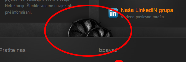
Two things are wrong with the design part of the Netokracija. First on the page there are two ventilator images that aren’t sending any message regarding the topics of Netokracija. The first ventilator image is at the ending of right sidbar
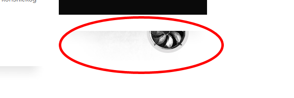
an the second is in the, other than that a really nice and functional, footer.
While here at the footer you can see a three column layout with two full height columns and a third column with three boxes. While it’s a nicely designed third column is not aligned with first two. It’s not neither symmetrical nor asymmetrical…
UX
While design has only two flaws, UX part has a bit more flaws. First, the logo of the site is incorporated with horizontal navigation and the logo is effecting on the navigation like it’s a tabbed navigation while in fact it isn’t. Also, logo of the site always has a white-grey background like the rest of the site and the effect is that the user is feeling that he is always on the Netkoracija page even thou that page doesn’t even exist as homepage is “Novosti i savjeti”!
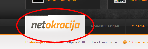
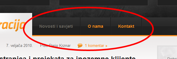
The text colour in the navigation is making the effect even stronger because the active page in the navigation is presented with grey text while other pages are presented with orange text
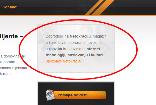
On the right is a welcome box “Dobrodošli na…” which is positioned on the most prominent place in the sidebar and is placed there on each and every page while more important boxes are positioned lower (like new and popular box).
And the most important thing, the page is missing a search feature.
Realigned
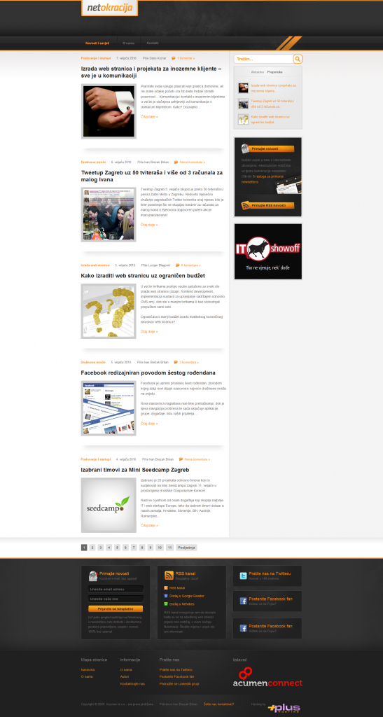
First I have moved the logo box from the navigation to the top of the page. The logo box has an orange 3px stroke and two 3px orange lines have been created to round-up the orange stroke and to counterweight the ornage line below the navigation. The navigation has been moved to tle left and the colours of the navigation text has been changed to orange for active page and grey for inactive pages with white hoover effect.
The sidebar got a grey background which stretches to the right edge of the browser. Two reasons for that. First to separate secondary from primary content and second to counterweight the fat grey outside strokes of the content images. In the sidebar the search box got the first position and it is styled to match the rest of the site. Next a “Popular and actual” box has been positioned as three post boxes have been removed. They were unnecessary as the same content is in the sidebar and in the header there is now some space for eventual advertising. The ventilator is removed from the bottom of the sidebar as it does not reflect the content of the site.
In the footer, the ventilator is removed and the LinkedIn box is pushed up to align with the first two columns.
And here is the result (click on the image to enlarge)
What do you think. Did I waste a Sunday afternoon for nothing or is it step forward from the original?
Definitely better than original. Excellent job!
LOL, no you didn’t. Thanks for the input. As I already told you in the comments at Netokracija, certain design decisions did have a point.
For example, the logo. You can’t put it on at the top because we’ll the featured articles as well as the future banners will be there. Putting the logo under, with the white background actually lets the user know – this is Netokracija, not the site that the banner shows for example, which happens with lots of websites.
In the realing the “Naslovna” link looks like an active one since all other links on the website are… orange. Maybe having another color for the selected link would be better, but this change isn’t more usable. :) As for the ventilators, they are going to play a big part in the future branding of Netokracija and of course have aren’t there for better usability. I don’t want Netokracija to be as bland as UseIt.com ;)
As far as the search goes – it will be added. One thing that I do like is the light grey background of the sidebar so thanks for that suggestion. :) Thanks for the input!
@Dario: thanks for the comment, it’s nice to have a positive feedback
@Ivan: For the logo, when you put it that way it does make sense :) For the links in the menu just setting a hoover to white would be great. And for the vents, I couldn’t understand them so I have suggested to remove them as they are not (currently :)) representing sites topics. If you say they will have a significant branding value, than I believe you :)
I would really like to hear from Vibor Cipan on UX point of view :)
Well at least someone believes me ;) Yeah, there were reasons for the design decisions but once again – thanks for your thoughts. :)